


 10 min read
 Apr 21, 2026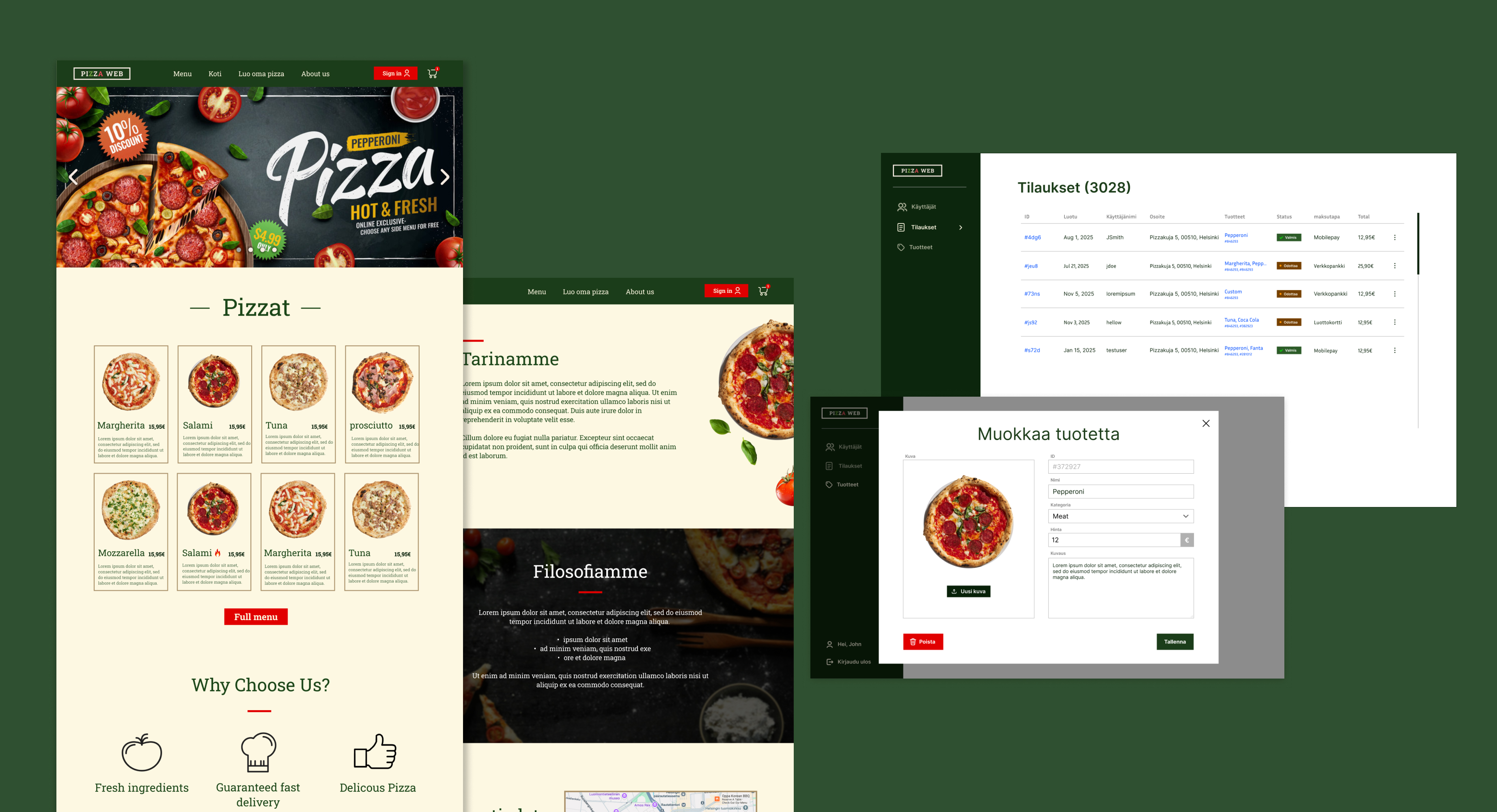
Pizzaweb is a fictional pizza ordering platform I designed as a university project and later used for a real pizzeria.
Within the first month, the live site had already processed over 40 orders — a strong sign that customers were comfortable using it to place real orders.
What is Pizzaweb?
Pizzaweb is a fictional pizza ordering platform designed to feel more like an authentic Italian pizzeria than a typical pizza restaurant website.
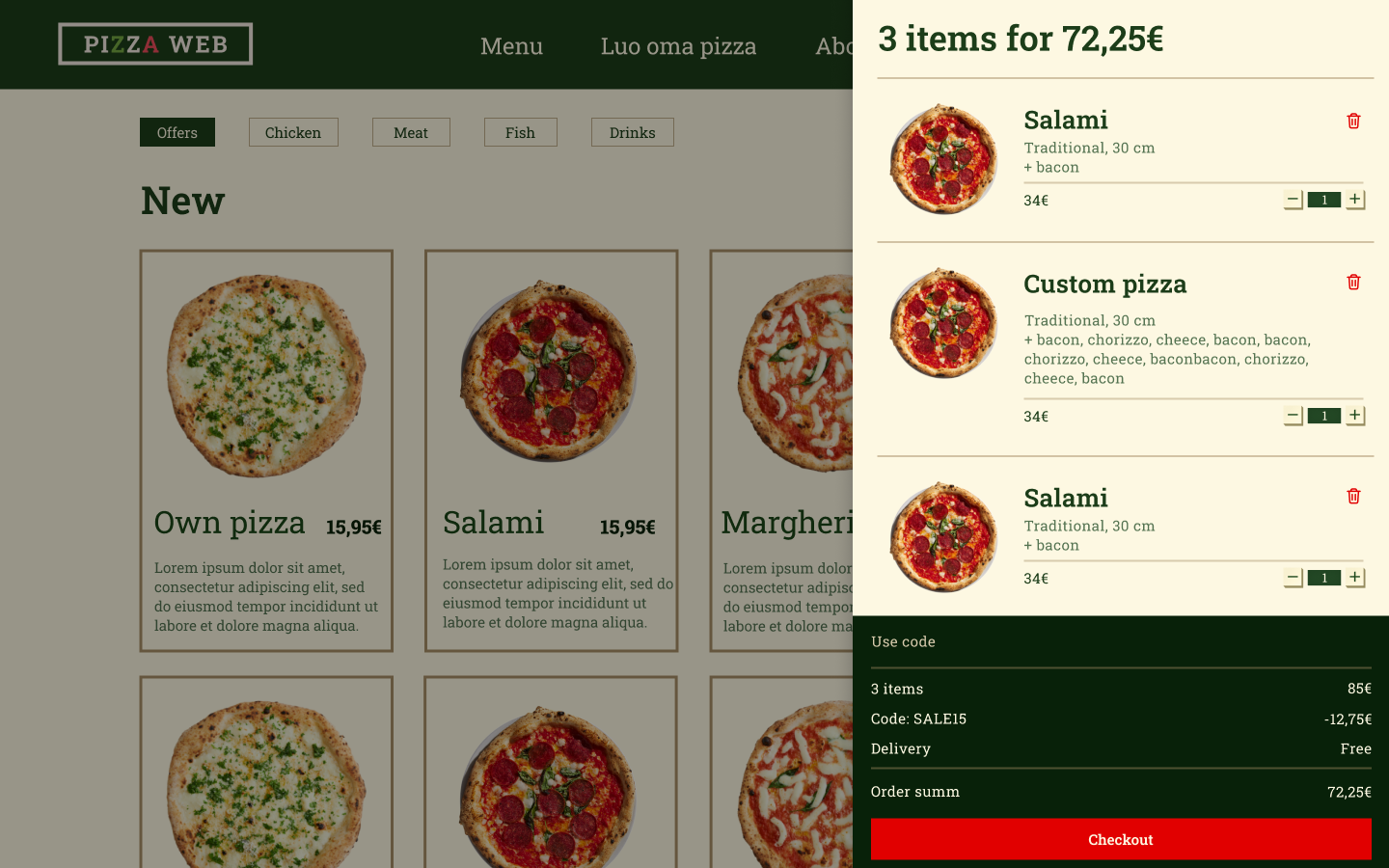
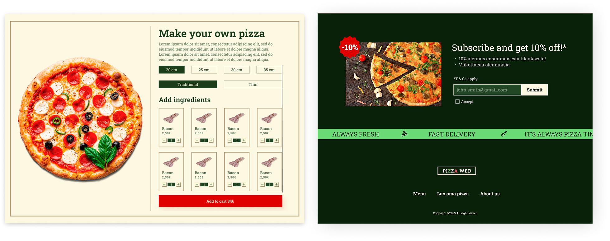
It has features for building your own pizza, and a newsletter section for promotions and discounts.
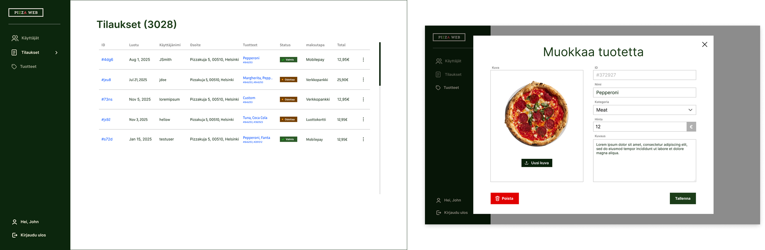
The restaurant owner can manage their products, orders, and customers from a simple admin panel.
I later used this design for a real client, a local pizza restaurant who needed their own website to fulfill orders. I created the website with Shopify to move quickly and to avoid unnecessary complexity, while using my UI from Pizzaweb. The client was very happy with the design and the website has been successful in attracting new customers and increasing sales.
Background
Our group had to create a React website with user auth, roles, and an admin page as part of a university project. One of my focuses on the project was the UI and UX design. We chose our topic to be a pizza ordering website since it was a clear and familiar use case.
We started from a completely blank canvas. The UI had to be simple, intuitive, and have a high-end feel since we sell authentic Italian pizzas.
The inspiration
Whenever I am designing something I always like to start from some inspiration. I try to question why existing solutions do things a certain way and then improve on top of what I find.
I started by defining what we want the look of the website to be. Some keywords I wanted to keep in mind were high-end, classic modern, fun, and Italian. I made sure that my designs always satisfied these keywords.
I most liked classicpizza.fi and kotipizza.fi (two finnish pizza chains).
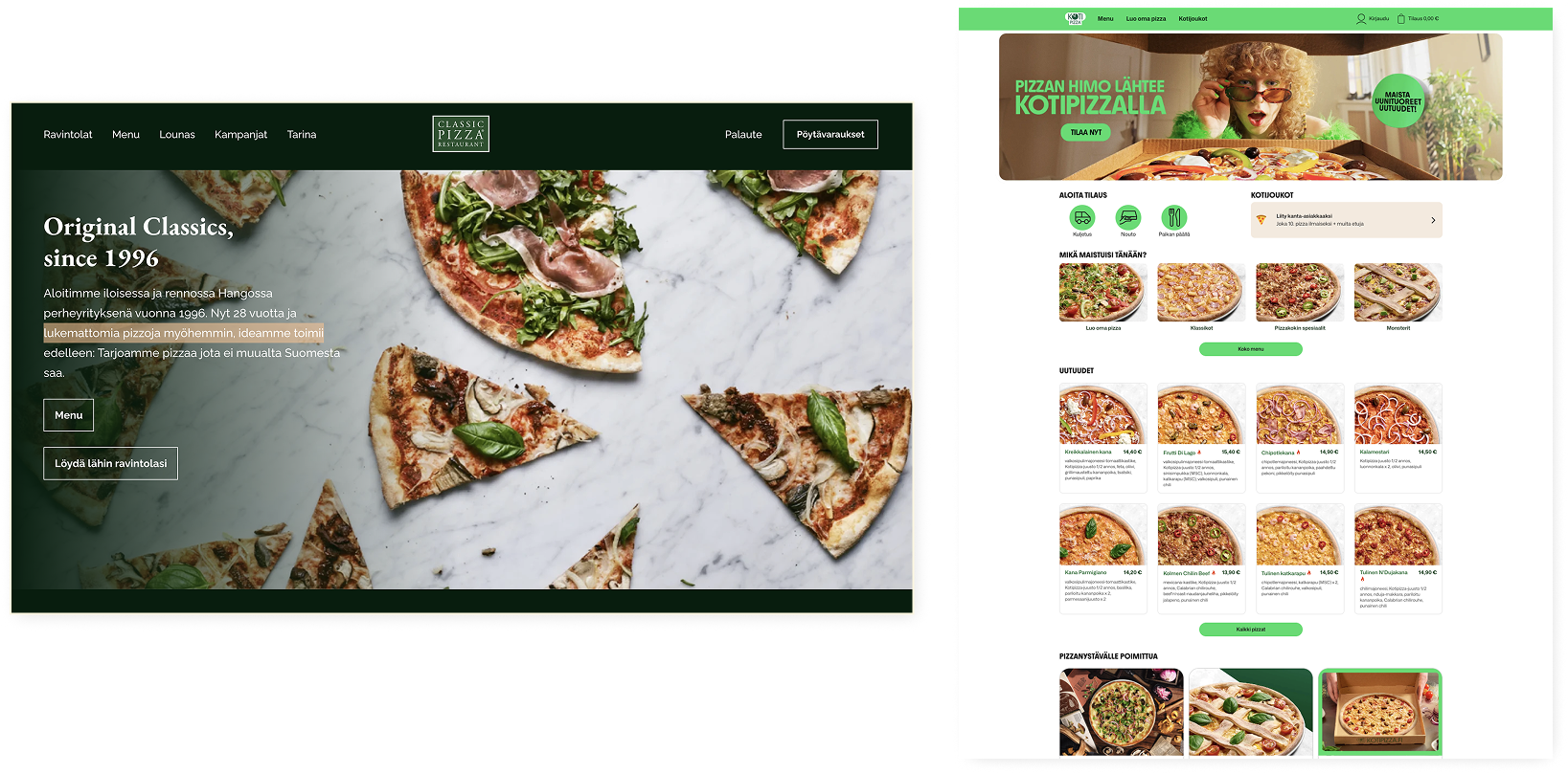
Classicpizza had the high-end look we were after. I really liked the dark green color and simplicity. For our primary color, I picked a similar dark green color as on Classicpizza. In Kotipizza I liked the overall structure of the website and the layout of product cards.
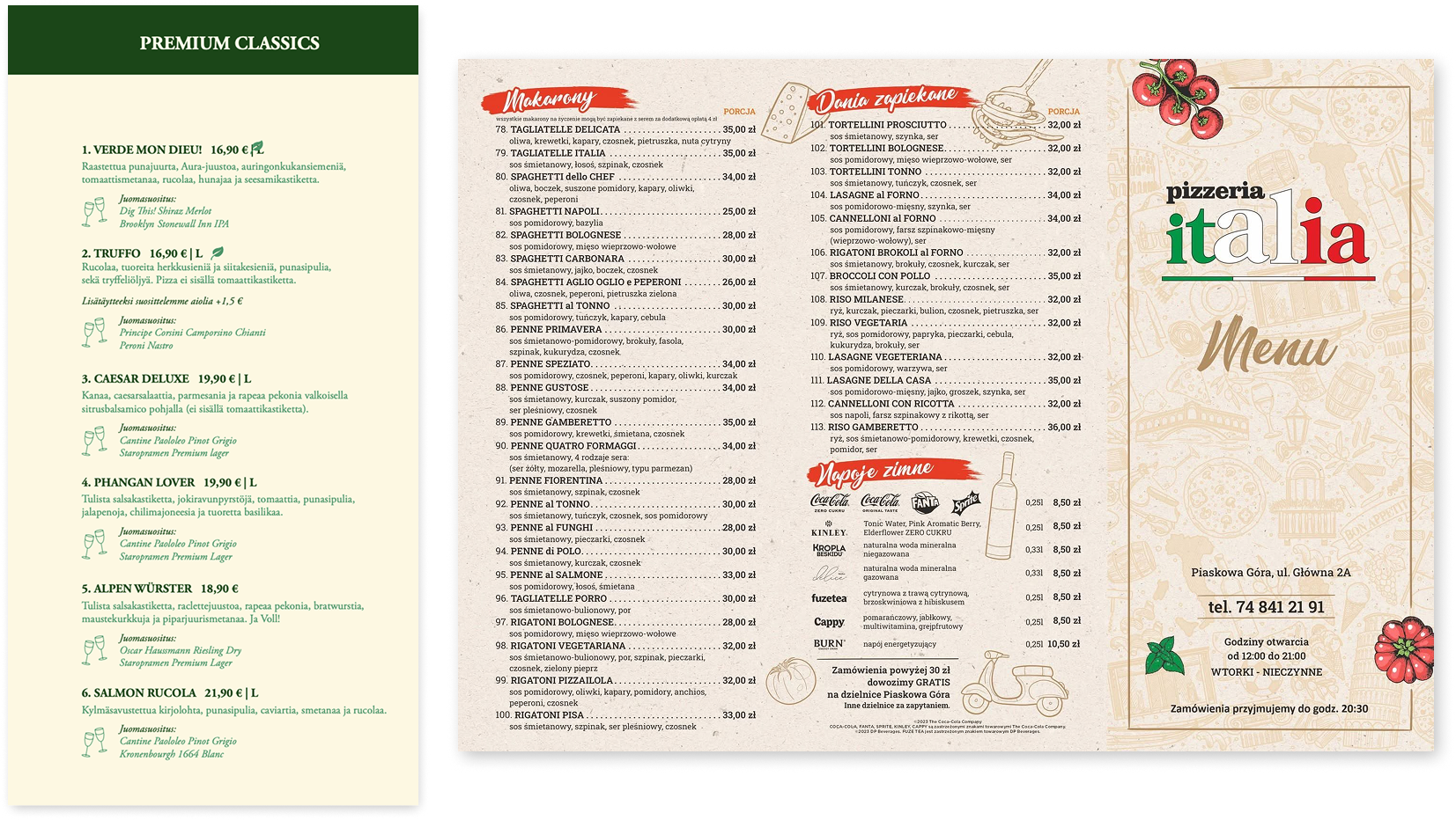
I also found these two menus. The right one had a classic Italian look, which our design needed. I took the light beige background from the menu on the left and used it as the background for our website.
A white background would have made the design feel too modern and sterile, while the beige adds warmth and a more traditional feel.
Also, you might notice that the design uses only square edges (there are actually no round edges in the whole design). Rounded edges would have pushed the design toward a more modern tech aesthetic, while sharp edges made everything more bold and classic.

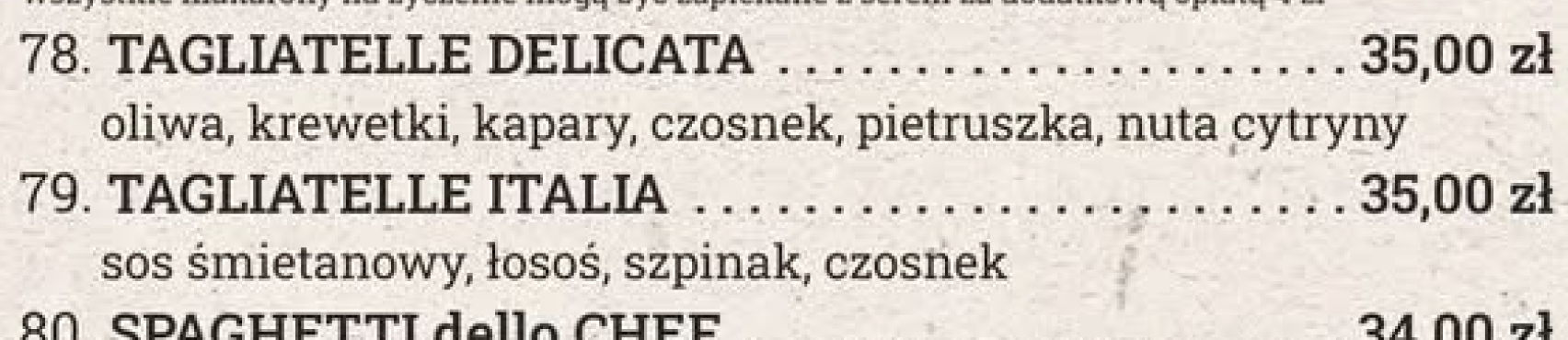
Lastly we needed a font. I looked for a font that matched the traditional Italian menu style and ended up choosing Roboto Slab from Google fonts , which was a close match.
So after all here were the design foundations:
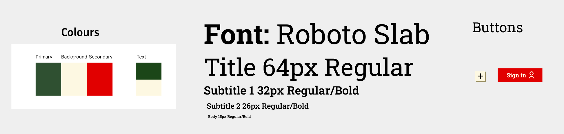
Also the red color inspiration came from the Italian menu example. It contrasts well with our beige and green. Below is a good example of the color being used to highlight the sign-up button.

Admin panel
Our core idea for the admin was that it should be simple. I first tried to use our navbar together with a sidebar navigation, but it just looked off. As you can see below.
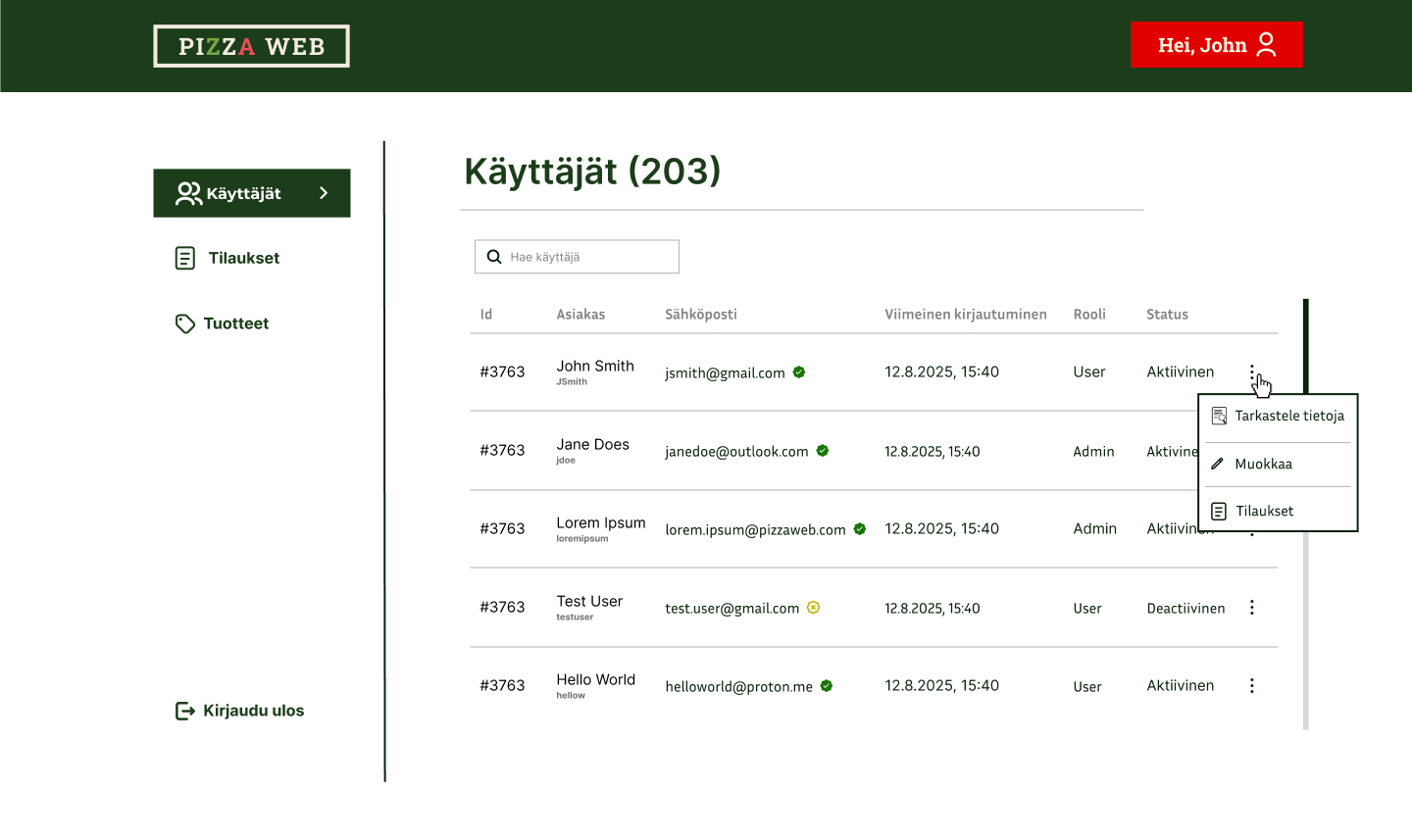
The navbar just wasted space at the top since there wasn't much content there.
So I moved everything to the sidebar and made it more pronounced.
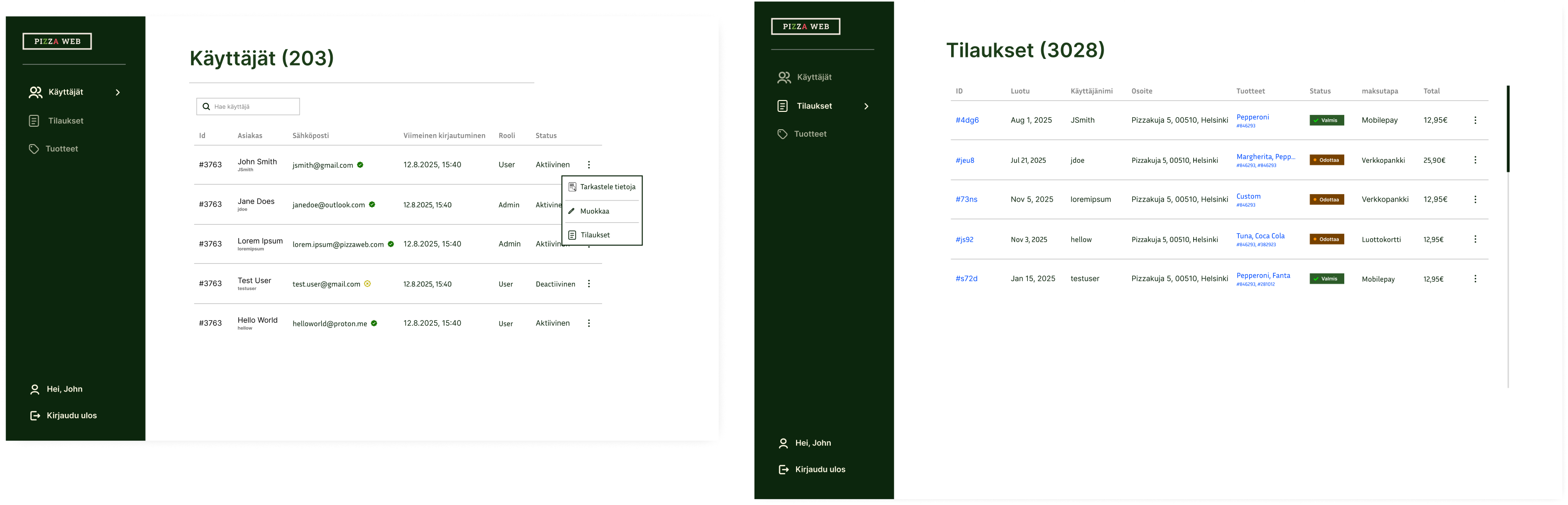
The sidebar only approach together with the white background made it clear that this was an admin page.
Using the same table structure in the users and orders pages keeps the interface consistent and reduced development costs. The table could accommodate any amount of data by becoming scrollable.
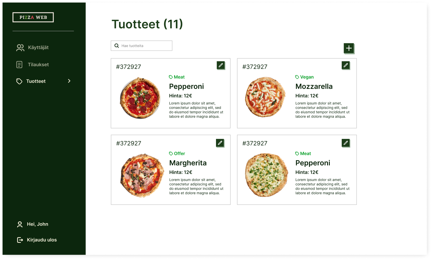
In the products tab I used cards since they could display a bigger product image which would make browsing for the right product faster. A table would have worked too, but cards fit this situation better.

If I were to improve the admin I could add a toggle to allow viewing products in a table.
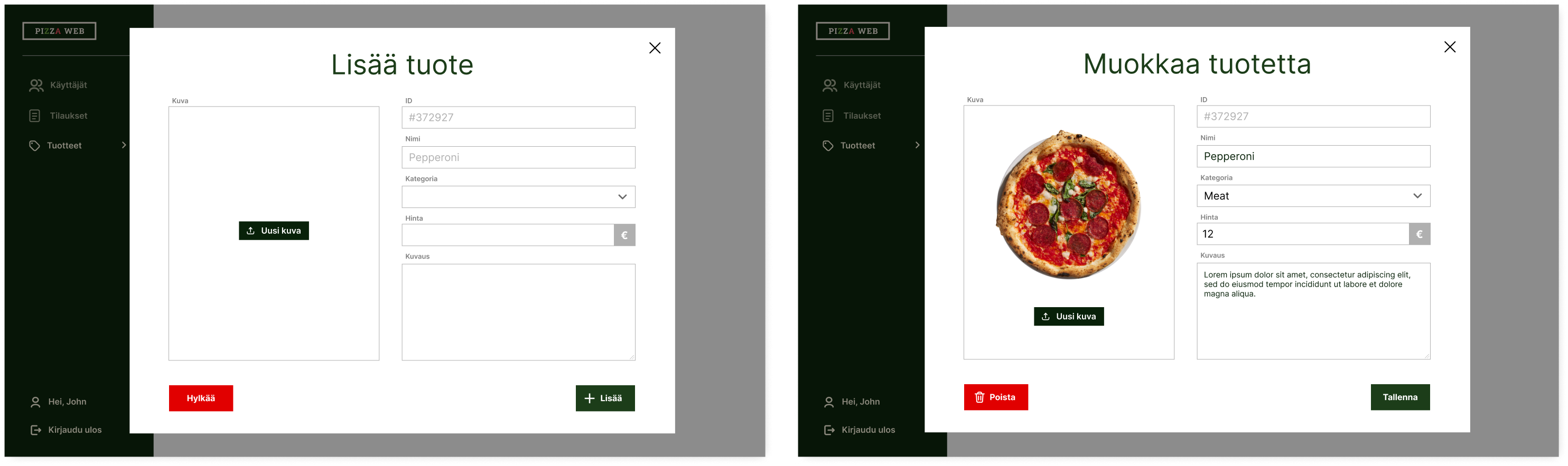
For editing or adding a product, I used modals. As you can see they look almost identical (another case where I could reuse components).
Also, what helped make the admin panel more fun and usable was the use of a lot of icons. Too often admin panels are very information heavy and non-visual.
I got all my icons from svgrepo.com. It's my go-to place for icons since I can just copy the SVG files of any icon and edit them however I want.
Pizzeria K&A
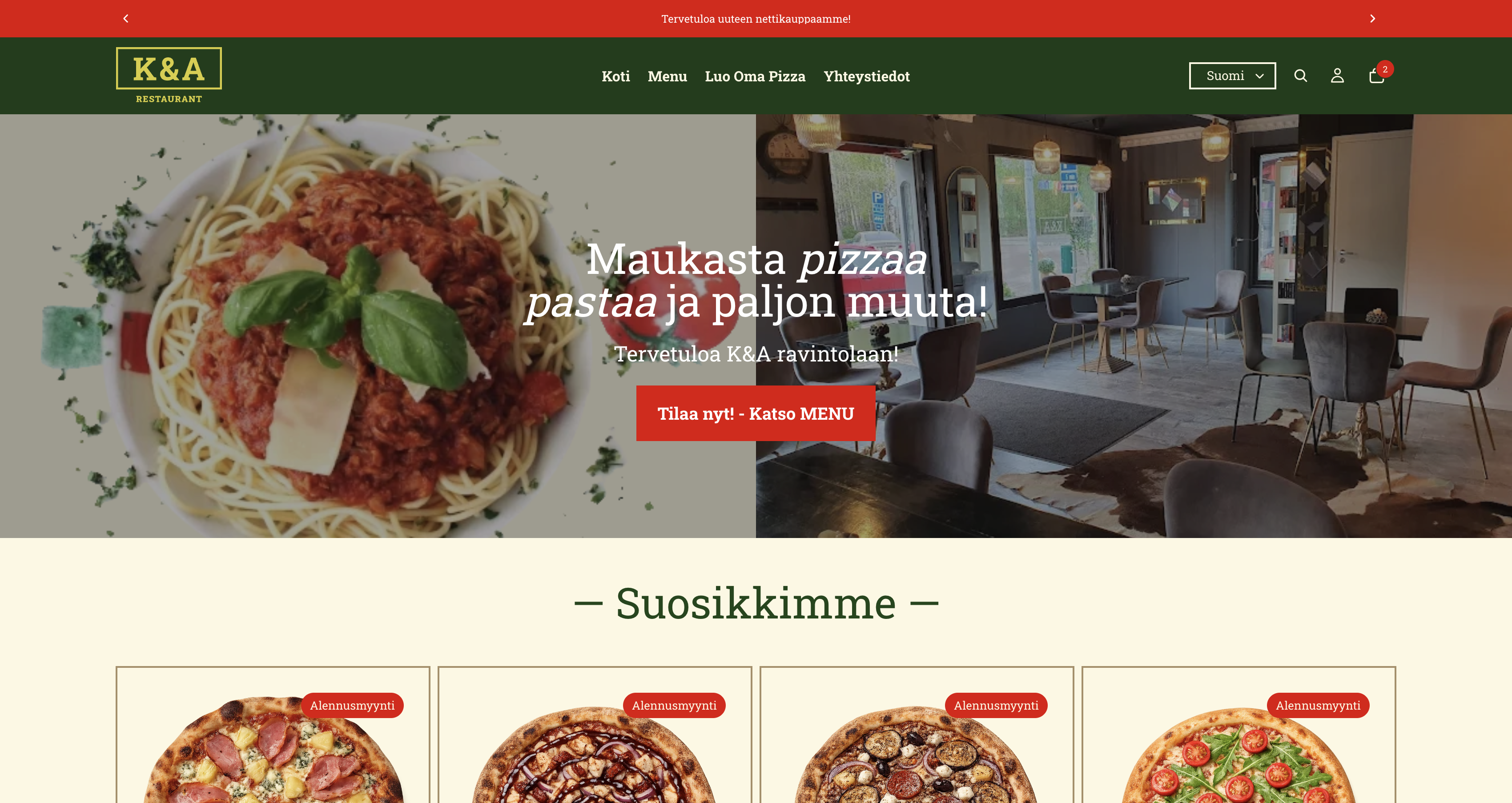
About a month after we had finished the university project a friend of mine approached me about his pizzeria client. The client wanted an online pizza ordering platform. My Pizzaweb design matched the look of the client's pizzeria. So I could use it pretty much 1 to 1 for their platform.
To build the website I decided to use Shopify. Even though we had built a React app, it wasn't directly usable for the client. A few features were missing and it would have required too much refactoring to make everything work. Shopify had already all the robust ecommerce features I would need which would have been time-consuming to build from scratch.
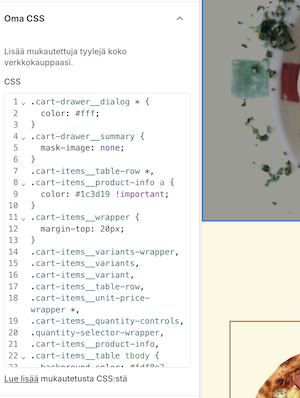
Thankfully Shopify allows using custom CSS on their themes. Without it, I wouldn't have been able to make my design work. There is a small tab where I can add whatever CSS rules to the theme.
After about 3 weeks (while being busy with work and my uni studies), the client website was ready. The owner loved the design, and so did customers. Fairly quickly the site started getting orders! Our first customers came from us running Facebook ads and by sending flyers.
After just over a month, the site has reached around 40 orders and 947 sessions. The design likely contributed to this by creating a clear and trustworthy ordering experience.
The next step is to do real usability tests with a few participants. This could bring good feedback for things that might need improvement. Then I would also have a complete design case study.
The live client website can be found here at ravintolakanda.fi.
Takeaways
I was working under a tight deadline when designing the site, so I had to make quick design decisions. Nevertheless, the final result turned out great.
It was great to implement this design for a real client. The best part about designing or developing anything is when real users get to benefit from your work. The biggest success of this project is that real customers are actively using the product. It’s a strong validation of the design and its ability to support a real business.
I also saw how valuable it is to start coding after the final UI is ready. This way the whole team clearly understands the vision and then everyone gets excited to build.
I would still like to do usability tests to further validate the design.
The live university Pizzaweb project website link: pizzeria-web
The live client website link: ravintolakanda.fi.